How to bring a product into the 21st century and Build Something for the future.
Process, Strategy, & Execution.
The Context
In 2018 Watermark Insights acquired Digital Measures, a company that made software which collected and organized data from academic faculty to streamline processes around things like accreditation and tenure.
The process of getting data into the system was completely manual and took roughly an hour per page of a CV. This represented an enormous commitment of time for faculty members, so Watermark wanted to find a way to automate the process to speed things up.
The company was 20 years old when it got acquired and had never employed a designer, relying instead on a committee of volunteers to make design decisions.
The Problem
I started my job at Watermark in the beginning of 2019 and was told that I’d need to have my first project done by the summer. Normally I’d consider that a very reasonable request but the project in question presented some interesting challenges.
The process of getting data into Digital Measures was tedious and time consuming, so much so that many users simply refused to do it. This meant that quite a few clients were spending quite a lot of money on a product that simply wasn’t doing its job. Needless to say, that’s hardly a sustainable situation and Watermark was very eager to find a solution, ideally one that felt modern and intuitive.
Unfortunately, Digital Measures was neither modern nor intuitive.
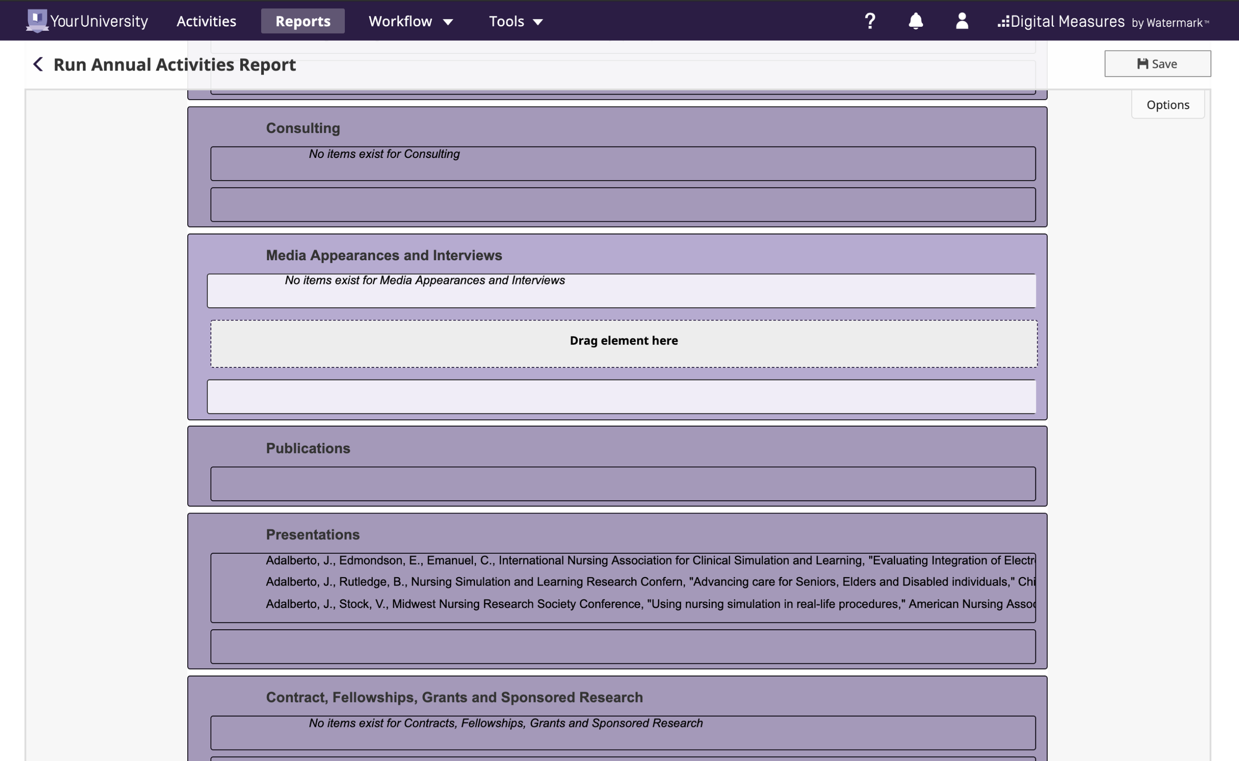
Screenshot of Digital Measures Before Design Updates
Building something new on such a shaky foundation — and in a few months no less — felt daunting. Luckily, some preliminary discovery work had been done a few months before I started.
The engineering team had built a demo called CV Imports that let users upload their CVs into the system, highlight the contents they wanted to upload, and then review and clean up the results before final submission. Around 100 users had been recruited to test this prototype and then give feedback via a System Usability Scale (SUS) test. The average score was 61, just a few points below the generally accepted average of 68, which seemed like a promising start.
Additionally, another team had done some research and found that, on average, it took about an hour to upload a page worth of content from a CV and that most CVs tended to be around eight pages long. Eight hours was a long time but it seemed like we’d be able to reasonably cut that down a bit.
So things seemed optimistic, until I found that all of that data was misleading or completely incorrect.
The average score of the SUS test was 61, but it wasn’t because the experience was slightly below average. A look at the individual scores showed that two cohorts had naturally emerged:
The first, smaller cohort absolutely loved the demo. Their scores were all just about as high as they could be and they also tended to be from people who worked in administration who had never had to upload data into the tool.
The second, slightly larger cohort absolutely hated the demo and, perhaps more notably, really hated Digital Measures. Their scores were about as low as could be and they tended to be from faculty members who did have experience using the tool.
Additionally, it turned out that faculty don’t typically have CVs that are only eight pages long. In fact, it’s not uncommon for them to be over a 100 pages long.
So things seemed pretty pessimistic, but there was work to be done and it was my job to do it.
The Process
The first thing I did was push back. It was clear that there were deeper issues with the product that needed to be resolved. Unfortunately, the business wasn’t willing to commit resources to solving those issues and felt that introducing a new feature would be a bigger driver for sales. After all, administrators were the ones making purchasing decisions and they loved the idea.
While I took issue with this argument, as a new employee I didn’t have the authority to push back further. So instead I focused on trying to do the best I could in the constraints I’d been given.
I started by trying to refine the original demo version of CV Imports from the first round of tests, with special focus on feedback that had come from faculty.
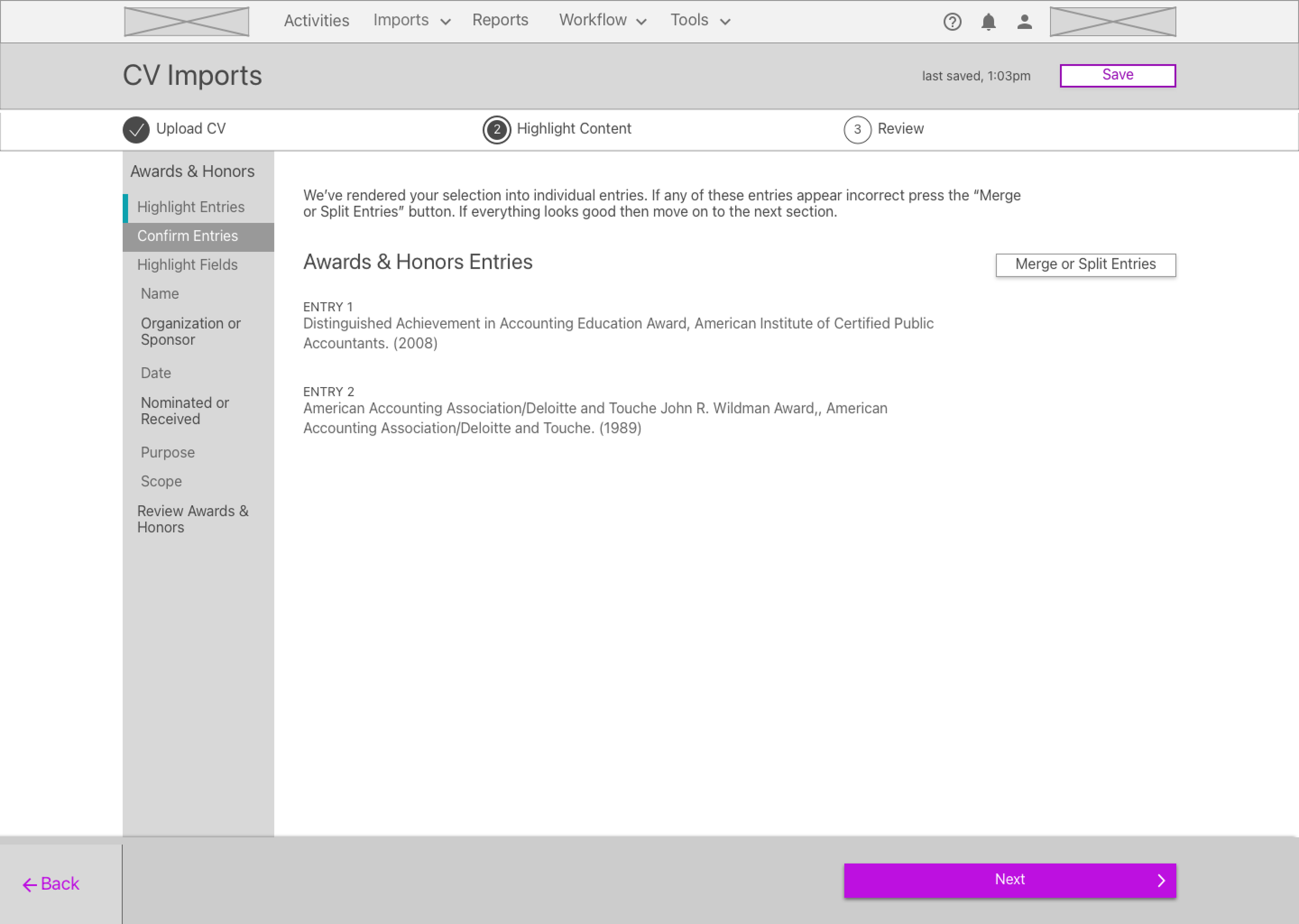
CV Imports Wireframe Sample.
I wireframed the entire workflow and organized a second round of user testing with a sample of faculty users. While the average score of this round was slightly lower than the first, the individual scores were far more closely grouped.
I incorporated feedback and began moving into visual design. Then, a new challenge emerged.
The company wanted a modern experience but, during the course of a separate project, a number of high-profile clients had made it clear that they didn’t want the look of the product to change dramatically. So I had to try and incorporate a modern experience into an interface that was profoundly out of date.
While I appreciated the perspective of the clients, I felt strongly that committing to an outdated design style was a bad idea. So I looked for ways we might be able to compromise and found a solution.
Senior leadership had recently decided to prioritize accessibility and make sure that all Watermark products were WCAG compliant and, at the time, Digital Measures was not. This was a known issue and plans were being made to address it, but due to the the scale and complexity of the product it was going to be a substantial effort. I made the argument that it seemed silly to design a new feature that wasn’t compliant since we’d just have to redesign it at some point in the future anyway, which would ultimately increase the cost of the project.
Leadership agreed and I was given the opportunity to incorporate new, more accessible elements into CV Imports — e.g. colors that had higher contrast ratio, restricted line lengths to enhance readability, and more defined header styles. The plan was to introduce these elements in CV Imports and then incorporate them into the rest of the product.
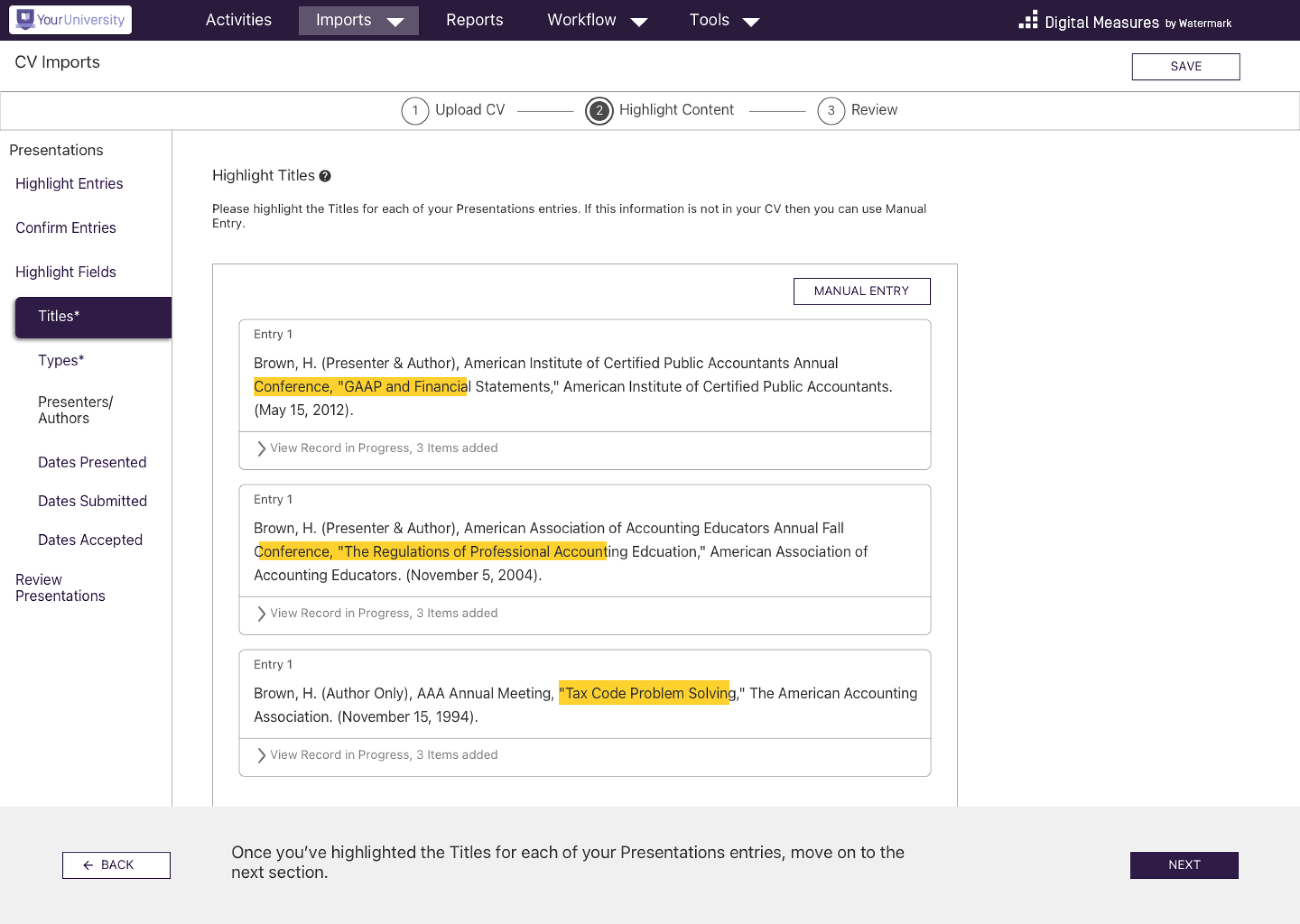
CV Imports Visual Design Sample.
I still had to create something that maintained the general look and feel of Digital Measures, but incorporating these more accessible elements did lead to something that was, relatively speaking, more modern feeling than other parts of the product.
We did another round of testing with the updated design and the feedback was generally quite positive. We signed off on those designs and the first version of CV Imports was born.
While this version did manage to meet the needs of the various stakeholders involved it was ultimately still a bit clunky. So, working off of what had been established, I also drafted up some samples of what a truly modern version of the experience might look like.
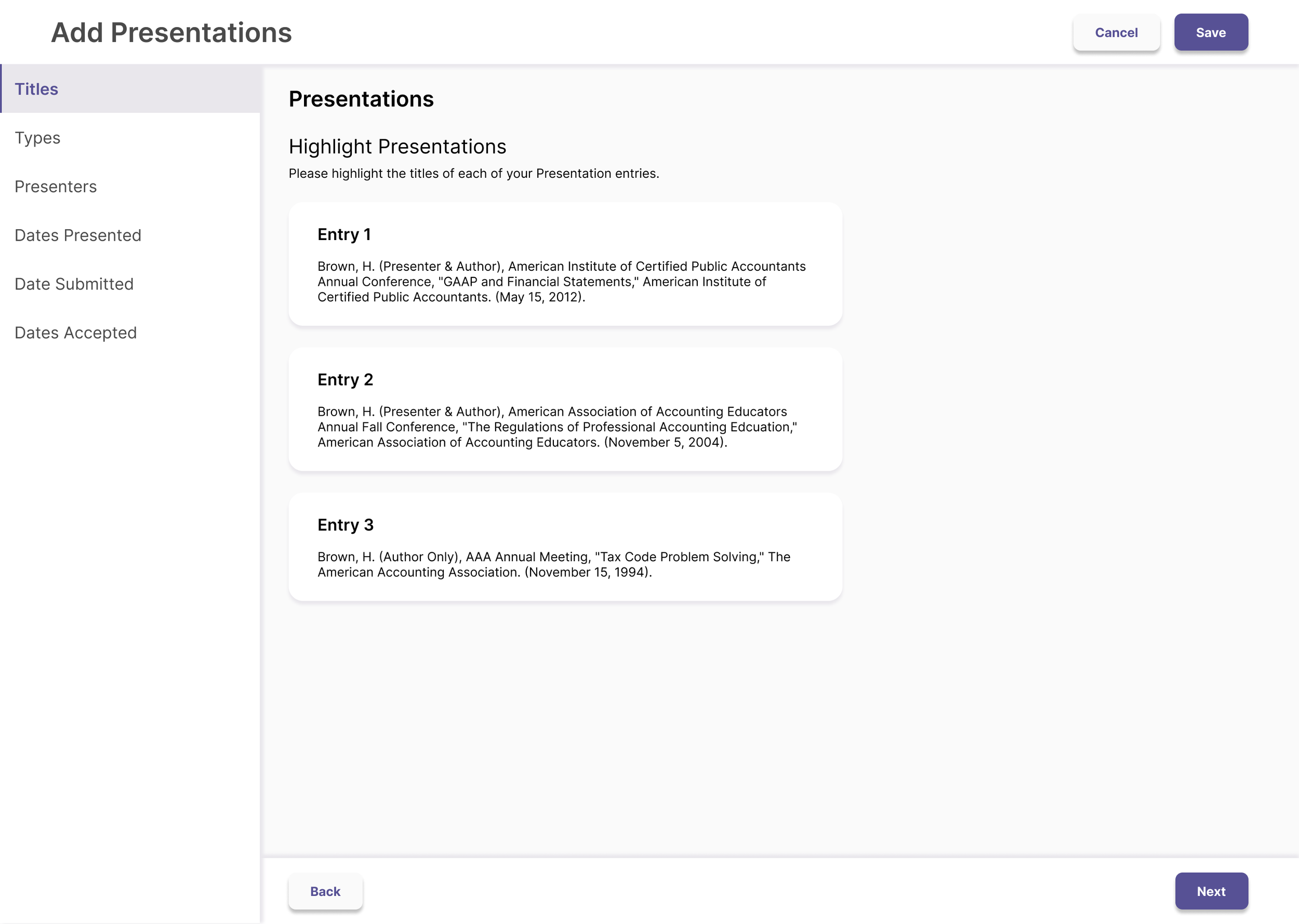
CV Imports Future Vision Concept.
The Results
We designed and built the first iteration of CV Imports and found that it was able to reduce entry time by up to 70%
We resolved a number of key accessibility issues, namely those related to contrast and page structure.
The data I gathered during the project helped to shift the product strategy to focus more on the needs of faculty.